

You can’t judge a book by its cover. And if you do, you have no idea just how 19th century you are.
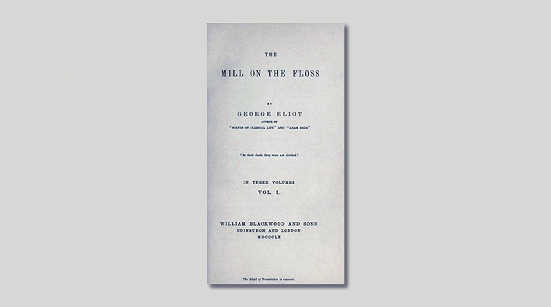
Whatever the origin of this pithy aphorism (widely attributed to Mr Tulliver in George Eliot’s The Mill on The Floss, saying how beautifully bound a book was), judging a book, a magazine or a person, by their cover is what we do all the time. Yet in this age of digi-everything, the challenges of making your cover art dazzle are greater than ever.
First impressions count
A glance at a bookshop display, scan a library bookshelf ( I am presuming you are in a very select minority), or scroll Amazon’s lengthy bestseller list and you will make a split-second decision about what kind of book this is from the title and cover art.
- Flowery illustration with brooding typeface – contemporary women’s fiction;
- Sepia city shot with over-emblazoned gold type – thriller, racey, very successful author;
- Silver Venetian mask shot against midnight black – erotica.
For those of us who want to be more instant and make a buying decision quickly, online retailers present a challenge. Books purchased online cannot be picked up, fondled and easily scanned to get more of a feel. There is no back cover with instant visual access to an eminent reviewer telling you whether you must, or should not bother, to read this work and why. No quick flick just to get reassurance.
If you are one of those who still indulge in the ancient art of book reading, you will find online exploration methods limited. You can, of course, visit your local Waterstones and complete your physical examinations there before purchasing online.
Waterstones’ Managing Director, James Daunt, acknowledged this was indeed often customer practice:
“You are in a bookshop, you can pick up any of these books – you haven’t bought them yet – you can browse them.”
He was apparently relaxed about this customer propensity. He goes on to suggest e-books should in the future offer the same at-a-glance capability.
“ Until you leave the shop you don’t have to pay for them, and that same principle should apply to a physical device as well as a digital e-book.”
But online, the presence of cover images is a (literally) a small part of the book’s presentation.
The art of the magazine cover
The role of the magazine cover has likewise changed. On the newsstand, where the majority of magazines are still purchased, covers remain the come-on. If the cover doesn’t do it for the consumer, he or she will simply not purchase. The newsstand mantra is still very much:
If the cover grabs, the customer buys.
As the newsstand market has grown, so have the laws of covers. Way back in 1973, when reading the printed word was not such an ancient art, National Lampoon ran this cover:
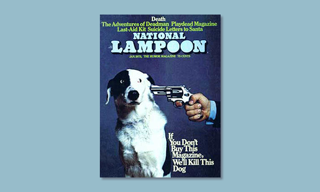
It became an iconic cover not just because it was witty but because it cheekily enticed the reader, proving the rule:
Great cover, great sales.
Magazine covers have always given readers their action cues: how to become beautiful, what to eat for weight loss, what films to see.
The underlying cue remains the same: pick me up, read me, buy me – but it has broadened.
Nowadays magazines are brands. Tough economic times have forced an evolution and magazines have morphed into greater beings:
- Colleges of further education (Vogue)
- Great chef makers (Restaurant Magazine)
- From print to online video (Cosmo TV)
And lots more besides, all because they started off as really great reads. The ingredients that are part of a magazine cover are now set on an even more challenging mission:
Like me, like my brand, engage with me more.
The publication masthead (title or nameplate) is a huge brand prompt.
“It’s me, The Economist, your intelligent friend, come on you know you want to be seen out with me!”
Or, women’s glossy:
“Hello, Rihanna here, look at me, you can’t be me but be part of my life… for a few minutes!”
The craft of the magazine cover lies in its choice of words, colours, image or cover shot, all meticulously chosen to encourage that split second decision to tease the consumer into picking the magazine up and reading or purchasing it.
Digital killed the cover star
In our omni-platform content age, magazine covers cannot have the same function in all media. They are not omni-powerful. While tablets’ lighting and animations enhance visual imagery, the environment in which magazines are sold or selected does not always allow a cover to strut its stuff.
In the app stores, thumbnail-size covers do not give the consumer a sweep of gorgeous visual come-on – as on the newsstand – but appear in subject categorised rows. The visitor is driven in their search by their topic of interest. The wonderful serendipity of a magazine cover which might entice a reader who has come to buy a fashion magazine into changing their mind and buying a walking magazine cannot operate.
I don’t predict a riot – there are few signs of new cover thinking on the newsstand – but the design of covers for online presence will begin to evolve as new rules emerge for standing out.
The emergence of a strong indie publishing sector continues cover design as an art in itself; magazines are returning to being thoughtful collations of beautifully designed content. As Jeremy Leslie from MagCulture told us at a talk we held about the transforming face of magazines:
“No-one knows the answers but the exciting thing is we are all trying to find them, and as a result, new things are happening.”