

Working with structured content is the future of publishing, whether publishing to print or digital mediums.
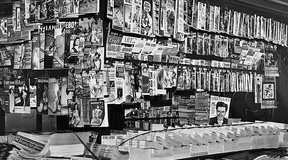
The death of print?
Working with structured content is the future of publishing, whether publishing to print or digital mediums.
Although print is going through a difficult phase, it’s certainly not ‘dead’. Nor will media be solely consumed on digital devices.
Print is still an important distribution platform for publishers; the two compliment each other. The future of print as an exclusive media for coffee table luxury magazines and books is far from the here and now.
There are still many consumers who do not have a tablet device, though many more have a smartphone. However accessible this may be, not everyone wants to read reams of copy in four point-size font.

There are pros and cons for each platform. On a digital publication you could have video of a fashion show, or a gallery of 100 pictures. If writing about music, you can listen to it directly from the device.
You can’t have that kind of interactivity in a print edition, yet there is more freedom to be creative with design. I envisage that the Art Director’s and Designer’s job will evolve through digital publications but not disappear entirely.

The benefit of digital processes
The starting point to creating successful digital magazines is putting structured content at the beginning of the publishing process. Structuring content with the use of Content Management Systems (CMS) streamlines workflows, freeing up more time for the team to be creative in other ways and learn new complementary skills. Digital animation, videos and social media applications all make the Creative team’s lives and jobs more dynamic and interesting.
I’ve embraced digital processes as they have become available to me throughout my career; who misses a chromalin and marking up an image for someone else to correct when a system can be put in place to colour balance that image before you put it on a layout? Today we have the software and skillset to retouch, extend or darken that image yourself to suit your layout needs here and now.
In the past, days were wasted sticking pages to a giant flat-plan on an office wall that was then immediately out of date, Now pages can be populated and changed via a digital flat-plan populated with adverts which are sold in real-time. The Book, which editors seem reluctant to replace, could now be scrolled through live in a digital dummy, accessed via the computer on their desk.
Digital processes are moving at a fast rate, too. Creating a print-ready page and saving it as a PDF to publish on mobile devices, used to be an easy and fast solution, yet the advent of smartphones has made this process redundant already. There is only so much ‘pinch and zoom’ a reader wants to do. Redesigning content multiple times for every device size and orientation isn’t the answer either.
I believe the efficient way of managing digital content is by structuring that content from the very beginning. Populating templates in InDesign for your print edition while populating scalable responsive templates for your digital offering at the same time is the most cost effective and logical way of developing digital editions today. It means that your existing team is able to create both the print and digital editions.

Developing Grazia’s digital edition
My introduction to Kaldor and their responsive design app platform, Pugpig, was via the magazine I helped launch, Grazia UK.
Like other consumer magazines we wanted to develop and expand our brand via digital media channels, including the launch of an app. So we set ourselves the challenge of creating an app that was published on a weekly basis that also included all the editorial content of the weekly print edition and a built in e-commerce shopping function – a.k.a. a shoppable app.
We didn’t have the funds to expand the team or time to work day and night shifts to get the work done and a PDF page turner was frowned upon.
We used scaling HTML web templates served via a CMS and delivered via an app container that was accessible to all platforms and device sizes without doing the work manually. This process enabled us to produce a weekly print issue of between 130 and 300 pages. We were designing the print pages, doing all our own re-touching and repro within a calibrated digital environment, as well as populating our app templates and creating the app on time using the existing art team – without night shifts!

The flexibility of design templates
Using 13 layout templates we were able to create weekly editions that didn’t feel visually repetitive. At Kaldor we have Pugpig clients using half this number of templates per edition whilst still producing beautiful apps
To decide how many templates we needed, I crammed as many different sections of the magazine into the same template as possible and expanded it from there. We adapted elements of the print edition too with animated introductory pages and bespoke pages for big features.
Despite designers’ fear of templates, all publications are templates to an extent in order to retain their look and brand identity, so this isn’t the daunting or limiting challenge your Designer might think. Once you dismiss the notion that you have to create a pixel perfect replica of a print product served via a digital device, the process of responsive design comes alive, and scaling content and stacking columns sized for different devices all from one upload brings the design process to life.
My advice if you are designing a digital edition; go beyond simple content delivery. Use your brand and expand your offering in a way that allows you to engage with your readers in a way that you cannot do in print. Commercially, you need to do this in a way that doesn’t mean massively expanding your editorial team.
Use a streamlined workflow and the right tools to give you universal access to preview your publication on all the different mobile, web browser and tablet devices without increasing your operational overhead.
Contact Jonathan via LinkedIn to find out more about Pugpig and digital design.
This article is taken from our series on the evolution of content.
Download the white paper Rock.Paper.Glass – the evolution of content.